

by Laura Koesten and Kathleen Gregory
Sharing and reusing data are seen as critical to solving the most complex problems of today. The world is producing an increasing amount of data, not only through science, but also as people engage with and are observed by technology in their daily lives. This has led to many efforts searching for smart ways of crunching large amounts of data automatically. But how do we, as humans, make sense of data in an increasingly ‘datafied’ world? How are we comfortable (or not comfortable) with reading, interpreting and working with data, be it in the form of spreadsheets or other collections of observations about the world, such as maps or images?
Data has more value when it gets reused. In order to be reused appropriately, data must first be understood. Our goal is to better understand how to help people make sense of data. While there has been quite a bit of research about how people find and make sense of textual information, we don’t yet know very much about how people make sense of data that someone else has created.
To look at this, we conducted a mixed-methods study with a group of highly data literate people – researchers from a variety of disciplinary domains. We asked them to describe and discuss data that they are familiar with, and then we asked them to look at and describe data that we provided. From these two perspectives, we identified common activity patterns when engaging with a dataset.
Pattern 1: Inspecting
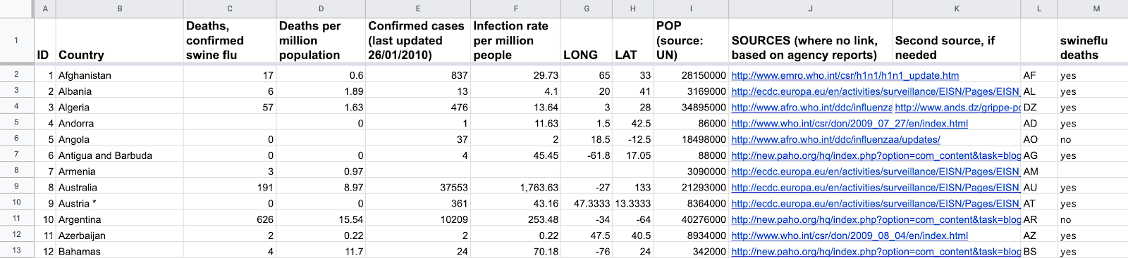
When inspecting a dataset, people try to get a broad overview of the data, by seeking to understand, for example, the data’s general topic, title, structure and format. People aim to get a feeling for the dataset, to understand its shape but also to understand what each column means and whether it has any attached constraints.
Pattern 2: Engaging
When engaging with data, people dig a bit deeper into the data, trying to find out how trustworthy it is, and whether the data contains the expected level of detail. This includes establishing relationships between columns, performing simple analyses, picking out examples of particular values, conducting quality assessments and trying to understand any uncertainty attached to the data.
This usually also includes noticing and investigating strange things, such as outliers, errors, missing data, or inconsistencies in formatting. Most people who work with data expect data to be messy and complex. The question for them is not if the data is messy, but rather if they can understand and work with that messiness.
Pattern 3: Placing
Placing happens when people try to put data in relation to the world and to different contexts. People work to understand how the data is related to a study design, to the norms in the discipline where the data was created, or whether the data is really representative of a geographic area or a certain time period. It helps to know the data’s original purpose and how it came to be in order to place it. Placing can also include trying to understand why a certain method was chosen or the unique, and local aspects of data collection and the biases within a dataset.
Implications
The better we understand the activities people undertake when making sense of data, the better will be the solutions we can design to support them in this process. We suggest some simple design recommendations for tools supporting data sensemaking and reuse. We are not aiming to reinvent the wheel with these recommendations, but rather to build on existing technologies. Our suggestions are valuable because they are a) backed up by scientific evidence and b) presented within a framework that can bring focus to design and development efforts for data-centric sensemaking.
To support inspecting:
- Provide summaries of the whole dataset (as text, as visualizations, as statistics)
- Provide summaries of the columns of a dataset (imagine a spreadsheet)
To support engaging:
- Flag and highlight strange things (for example values that don’t fit in that could be errors or outliers)
- Highlight relationships between columns or entities in the datasets (for example if a column represents a calculation based on two other columns, such as a percentage)
- Display trends and patterns (for example, point to obvious characteristics of the dataset through charts or in a dataset summary)
To support placing:
Tools should be designed to embrace different levels of expertise, allowing a potential data consumer to drill down to the desired level of detail.
- Allow zooming in and out of the data (this could help a person to understand the scope and where it fits in relation to the world)
- Include links to basic concepts and official definitions of terms or that are used so that there is no dispute about what was meant (in the data or in the documentation)
- Place geographic data on a map and temporal data on a timeline to allow people to relate it to events and to understand representativeness
These design recommendations for tools and documentation practices can be used to facilitate sensemaking and subsequent data reuse. Reuse will happen in different and diverse contexts. Therefore data needs to be presented in a transparent manner that allows different perspectives and supports understanding the uncertainties attached to it. We like to think about data reuse as being a form of collaboration between the data producer and the data consumer. We envision the recommendations we propose here as a step towards facilitating the conversation between data producers and consumers that is implicit in reusing data.
This post is based on a preprint available under: https://arxiv.org/abs/1911.09041